Present in a billion market, the Games of Legends portal makes life easier for analysts and fans alike with detailed real-time information about the League of Legends competitive scene.
Games of Legends (GoL) is a website that provides information and statistics about the main professional League of Legends competitions - a game that has about 100 million monthly active users and that, for curiosity purposes, I have a certain ability 😜
Their main goal is to provide a demand for data by specific groups composed of professional analysts, content producers, bettors and some curious people. But are they executing this proposal with mastery? Based on that, I mapped the experience to identify possible problems and thus propose improvements to the product.
Initially I navigated through the platform understanding how the service works and the layout of the information. This previous study provided important inputs and more context for the execution of the next step, a series of interviews with users.
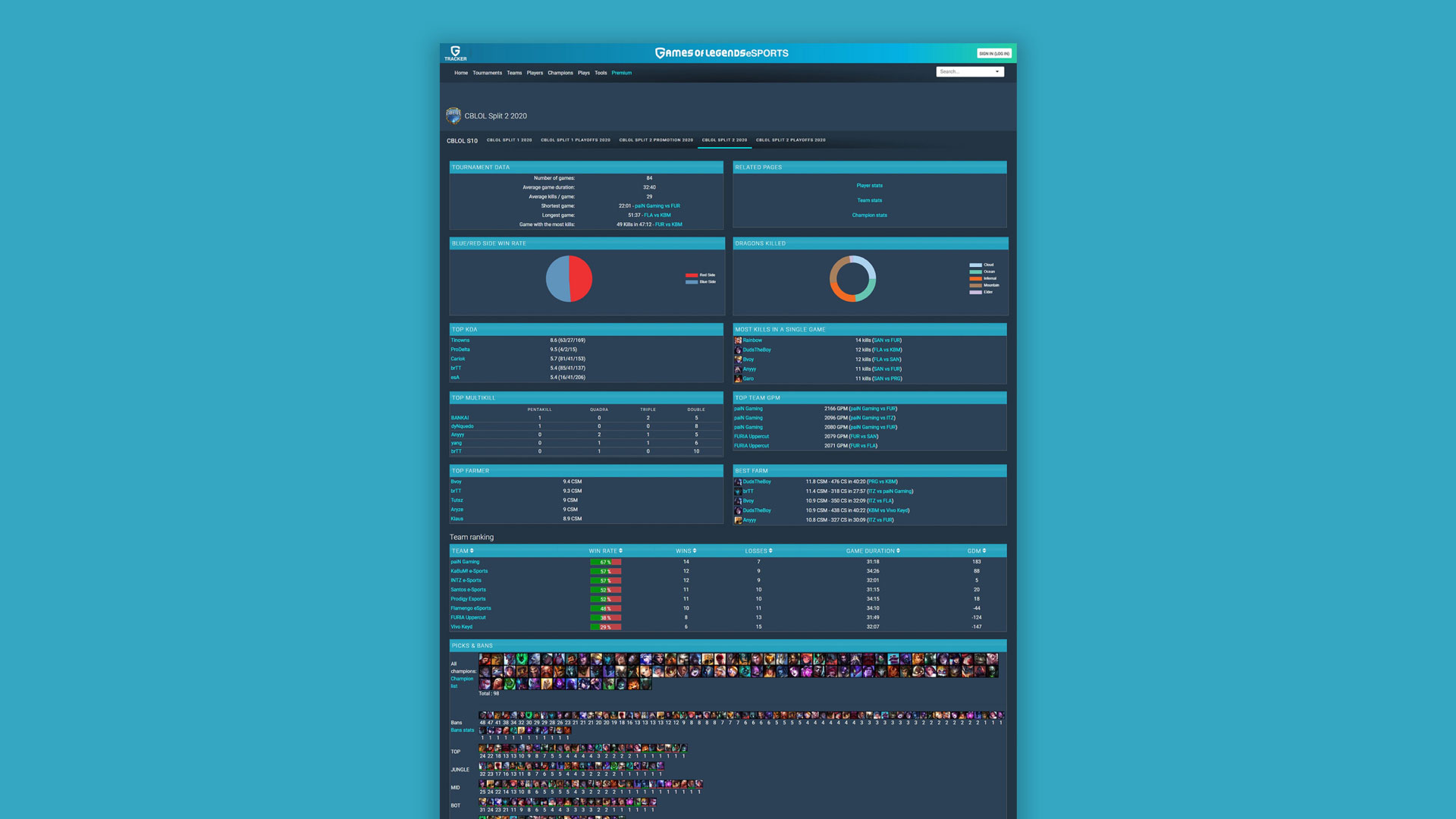
The conversations were very productive with rich feedback that gave a concrete direction to follow. Thus, I came to the conclusion that the platform's content is useful and highly relevant to users, but the organization of the numerous information is sometimes confusing and makes it difficult to understand - data that should be within easy reach ends up being hidden by other less relevant data.
Having gone through the previous stages, I was more confident about the ideation part - this was one of the goals, no doubt. And, consequently, I outlined several suggestions and proposals for improvements (some good ones, which matured naturally, and others not so much).
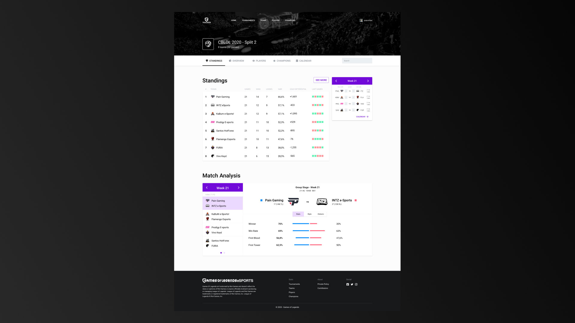
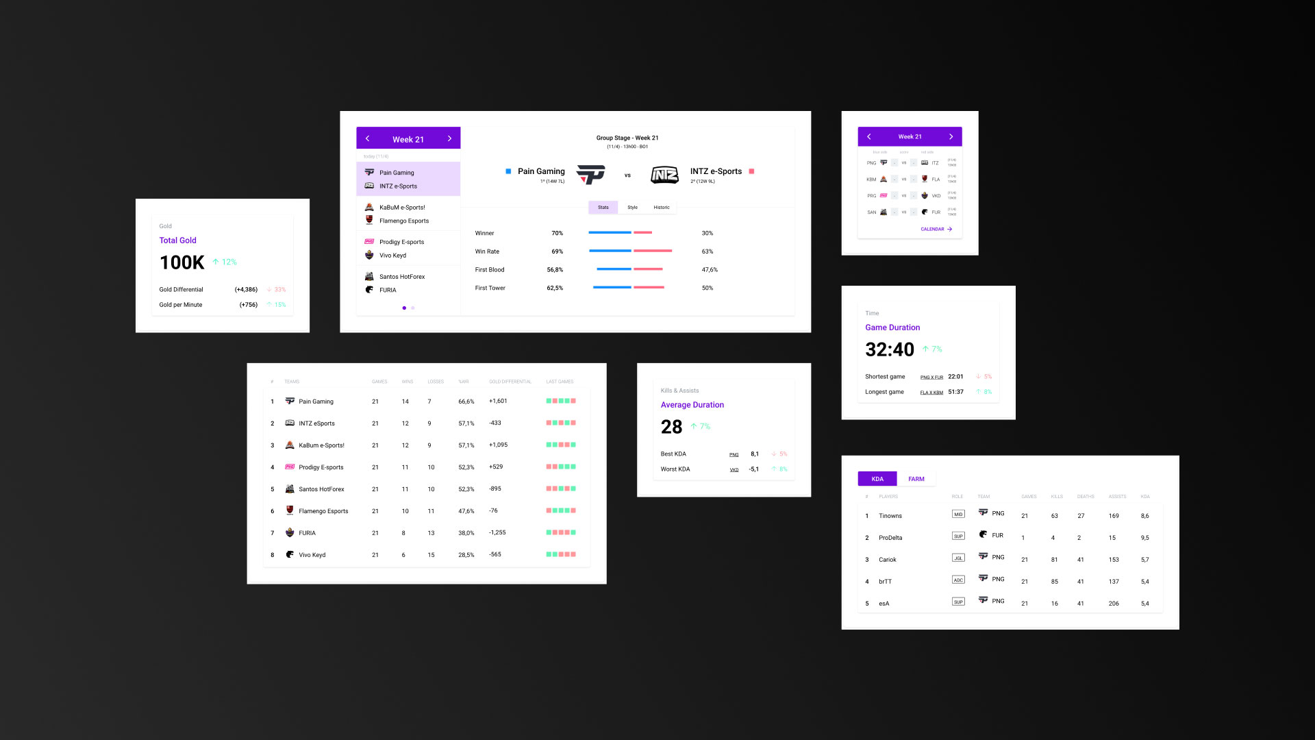
The information was categorized according to its subject matter, type of data, and degree of relevance to the site's users. The data regrouped by means of a menu of tabs brought a better field of vision while gaining practicality in reading - adiós to the long scrolls to locate what you need.
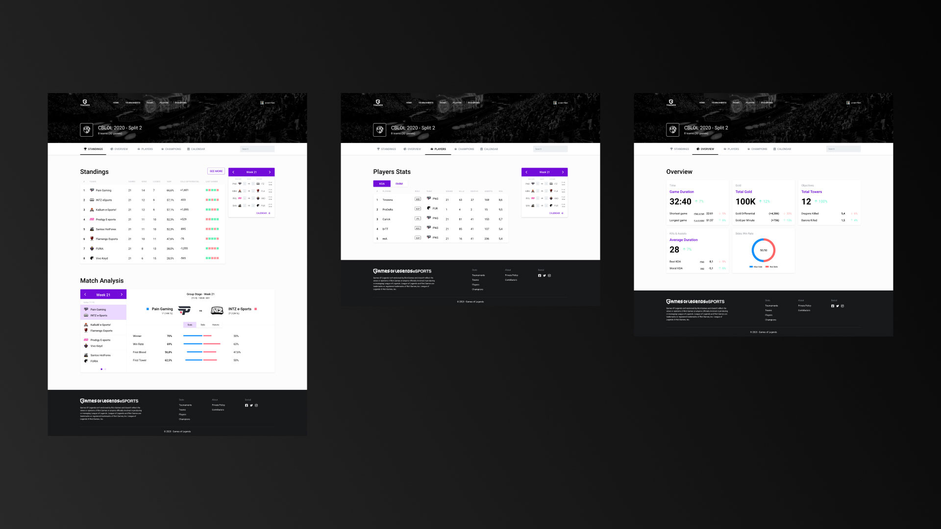
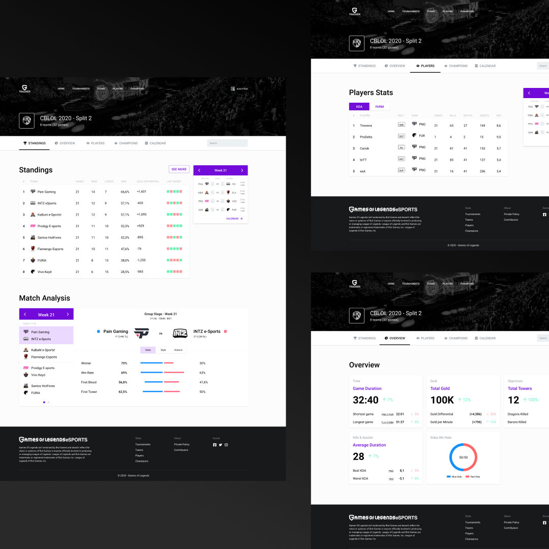
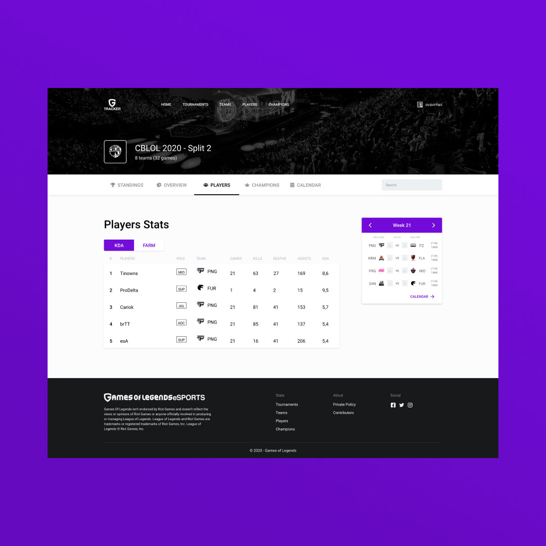
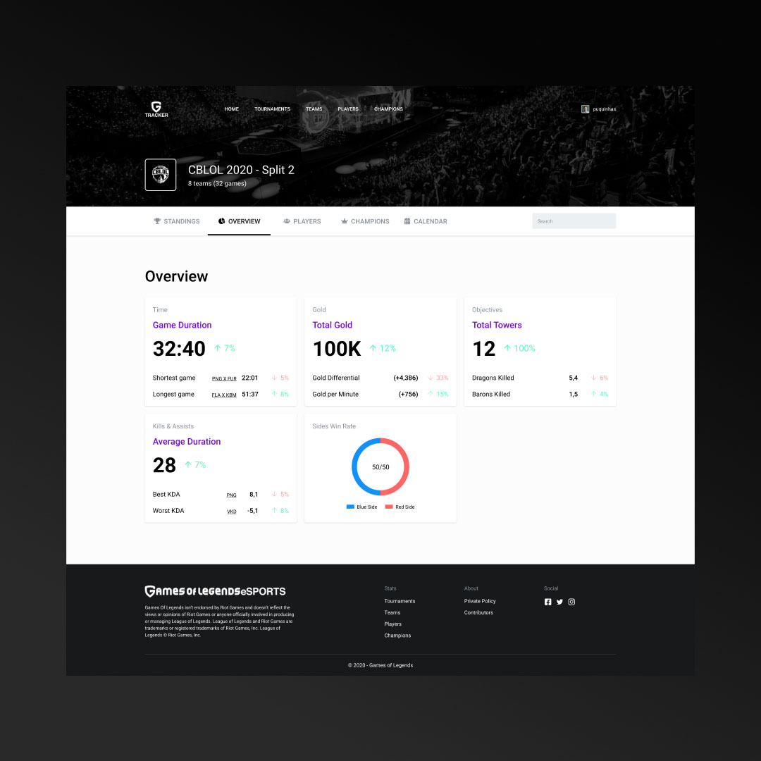
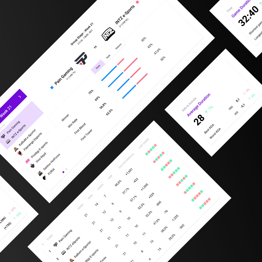
Newly created components bring consistency, clarity, and naturalness to the interface. Buttons, graphics, menus and tables were completely restructured following previously defined standards.
Executing this project brought knowledge related to the importance of good information architecture planning in practice. Obviously the proposal here is not only to point out errors contained in the platform, but to identify and work with them, using them to generate new learning.
Contact me and present your new ideas.
Product design specialist
based in São Paulo, Brazil
lprandi22@gmail.com
(11) 98461-0459

